
Top Call to Action Image Examples for Your Business
By Charles Fields
Are you in need for some call to action image inspirations for your next marketing campaigns? Maybe your current CTA buttons don’t give you enough clicks? Are you looking for some new types of CTAs to use?
Well, this is about to change.
For today’s article, we’ve prepared a list of top call to action image examples for your business. The examples in the article come from real and well-known brands in their fields.
So let’s not waste any more time and get right into it!
What is a call to action image?
In marketing, a call to action image (also known as CTA) is a prompt that invites the reader to take some specific action, such as buying a product or registering for a newsletter. Such calls to action can take place in various places and forms, like websites, email and popup.

Top call to action image inspirations to boost your CTA conversion rate
Creating an effective call to action image for your business can be a tough nut to crack. See how top brands are doing it to maximise their click through rates:
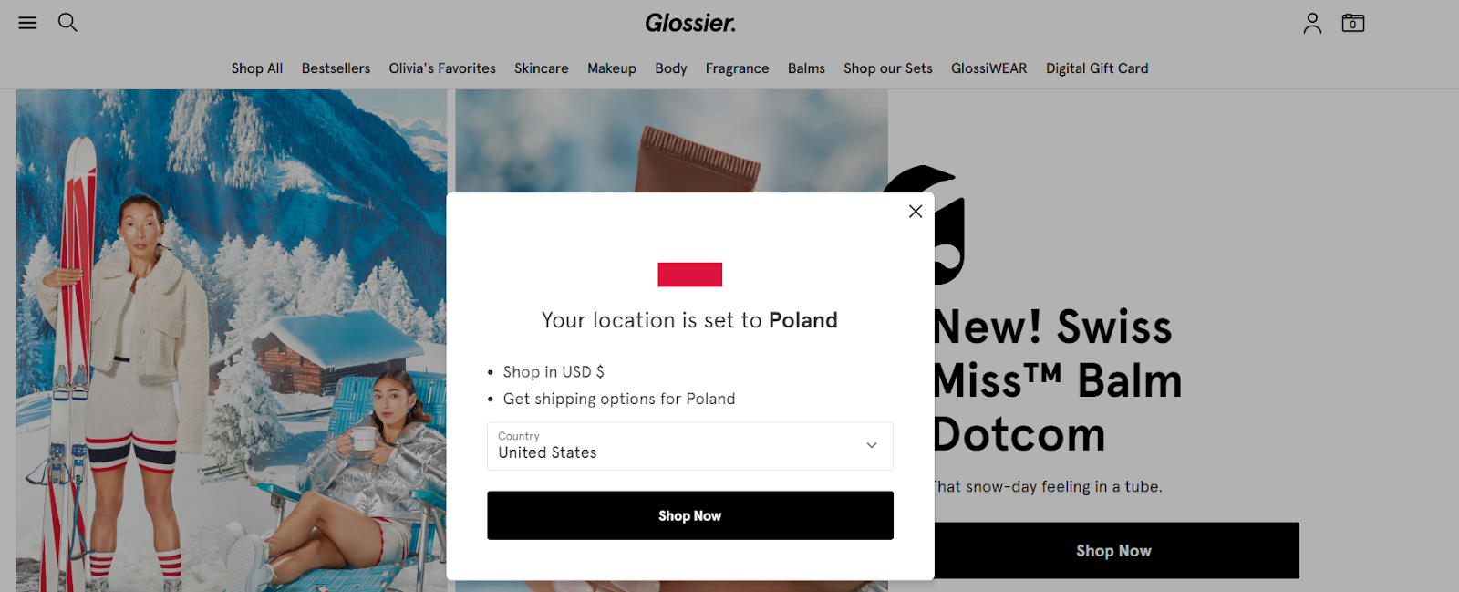
#1 Shop Now - Glossier
The first example is a “Show Now” button on a website pop up by Glossier.
It can be spotted quite easily, so it should attract lots of clicks. On the other hand though, it’s with mentioning that this CTA button is located on a pop up.
If your website visitors aren’t fans of pop ups, you may have to find another spot for your CTA button.
Don’t worry though - as you can see Glossier took this into consideration and included the same button directly on the website.
✔️Pro: easy to distinguish thanks to a different color, also available on the website
❌Con: some people automatically close pop ups without even reading them
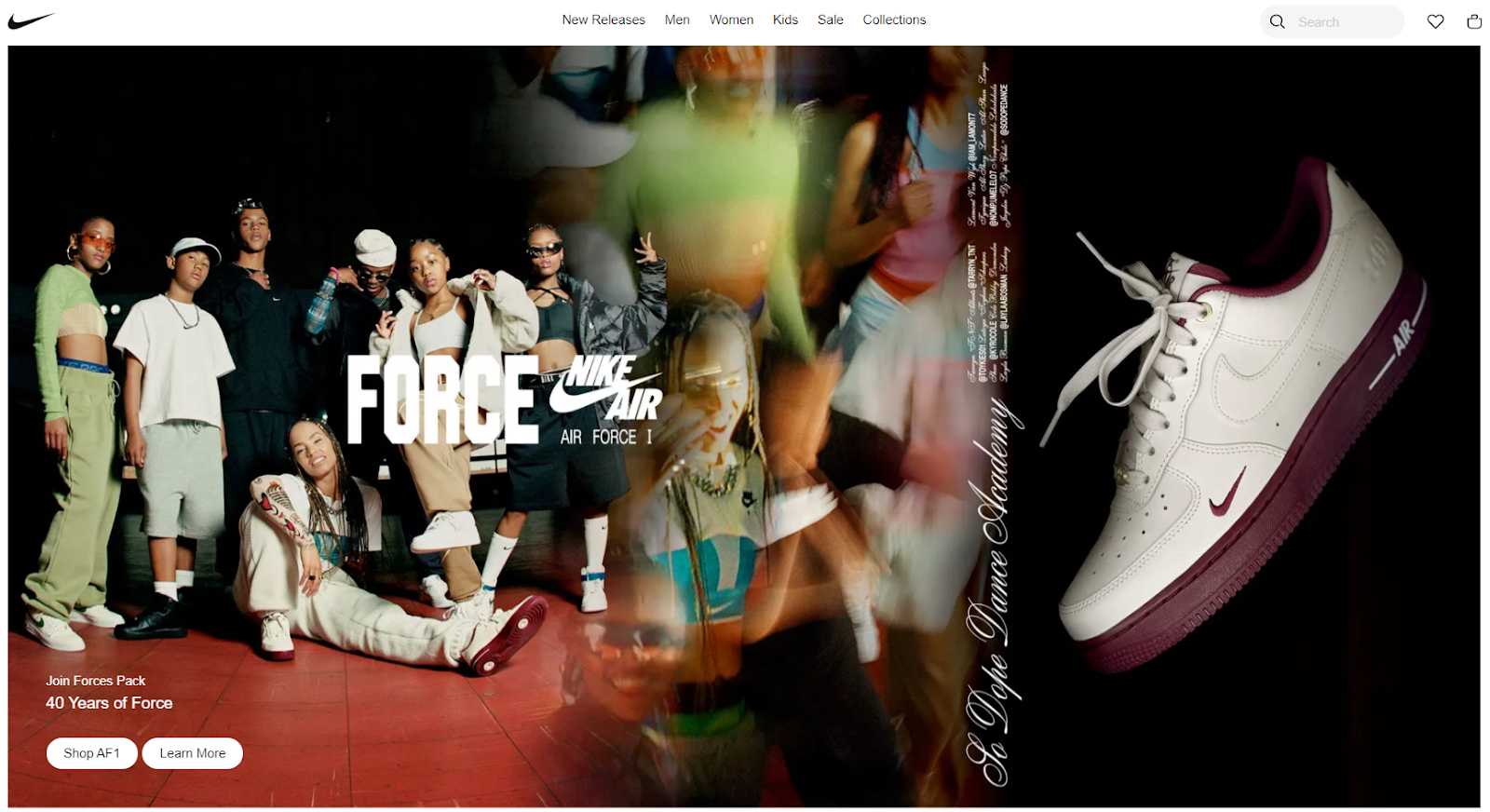
#2 Learn more - Nike
Surely everybody knows Nike, but not everyone knows their CTA images. And if you don’t know them yet, it should now change.
Nike’s CTA images are very subtle, yet convincing. This brand has always known how to persuade their customers with little efforts.
In this example, their CTA button is positioned in the lower left corner of the banner image. We think it’s easy to notice - so congrats to Nike website designers.
If you’re a brand similar to Nike, you could inspire yourself with this example.
✔️Pro: Easy to spot on the graphic
❌Con: Standard, basic text
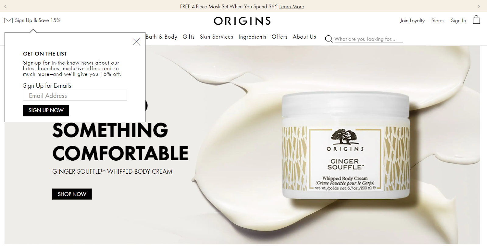
#3 Sign up now - Origins
Moving on, let’s take a look at this example from Origins - an American cosmetics brand founded by Leonard Lauder.
This example is another subtle and minimalistic one, yet it seems really attractive. It’s positioned in the upper left corner of the website and promotes the brand’s email marketing.
This is yet another example you could implement on your website.
✔️Pro: CTA pop up appears directly after opening the website
❌Con: some people automatically close pop ups without even reading them
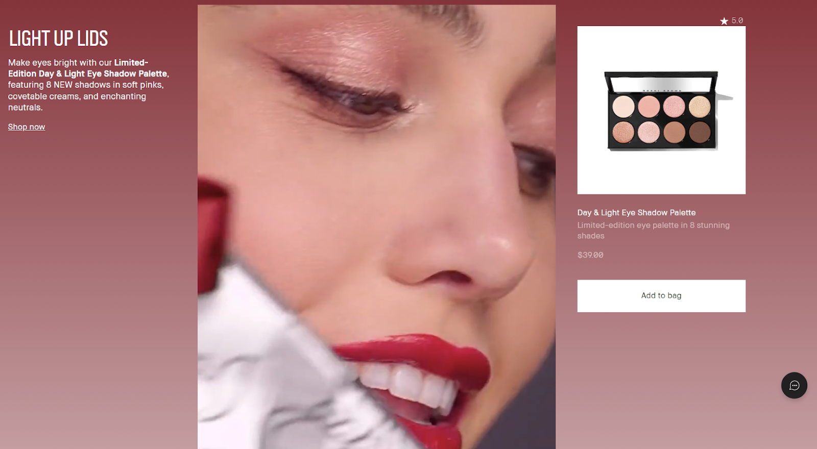
#4 Add to bag - Bobbi Brown
If you’re running an online store with any type of products, it might be a good idea to add an “add to bag” CTA button on your website.
At least this is what you can see on Bobbi Brown’s website.
This particular call to action button is easy to spot, so it most likely attracts lots of clicks. On the other hand,
✔️Pro: Easy to spot on the graphic
❌Con: Gives a sales-y feeling, encouraging to purchase
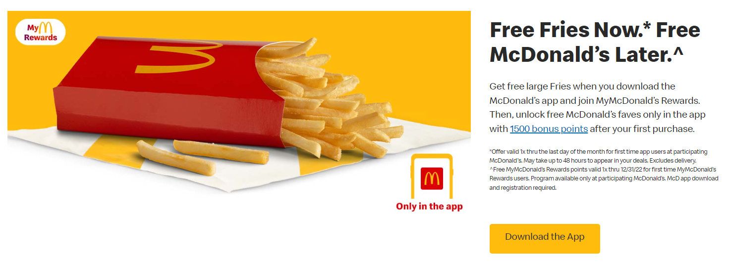
#5 Download the app - McDonald’s
Are you looking forward to increasing the number of downloads of your mobile app? McDonald’s knows how to do it just the right way.
Their “Download the App” button connected with a special promotion deal looks interesting on the website.
This is yet another example that may be used on your website.
✔️Pro: Easy to spot on the graphic and done together with a promotion
❌Con: None
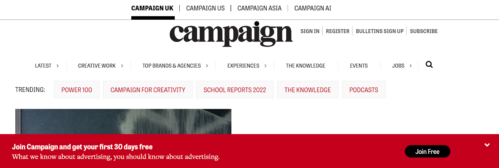
#6 Join free - Campaign
As we go further with our inspirations for you, next up on the list is Campaign and their “Join Free” call to action button.
The button can be seen immediately after you open the website. It encourages visitors to join their mailing program. After reading the whole headline, we can see it means joining for free for just 30 days.
The message is placed in an easy to notice spot.
✔️Pro: Easy to spot on the graphic, clear message
❌Con: It’s on a roll-down pop-up that may be disregarded by website visitors
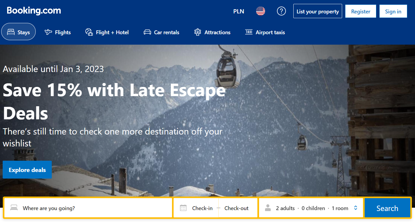
#7 Explore deals - Booking
Booking’s website is another great source where you can get various inspirations for your perfect call to action image design.
In this case, we’re looking at a “Explore deals” button. It’s supposed to encourage people to check out
✔️Pro: Interesting and catching title
❌Con: Slightly difficult to notice among other buttons
#8 Get started - FeedHive
Now, let’s take a look at this social media automation tool’s - FeedHive - CTA image & button.
As you enter the FeedHive.io website, you can almost immediately see the “Get started” button. It’s positioned right in the center and encourages visitors to start using the tool.
In case someone misses it, the same button can also be found in the upper right corner.
✔️Pro: Easy to spot on the graphic, clear message, placed in more than 1 place
❌Con: None

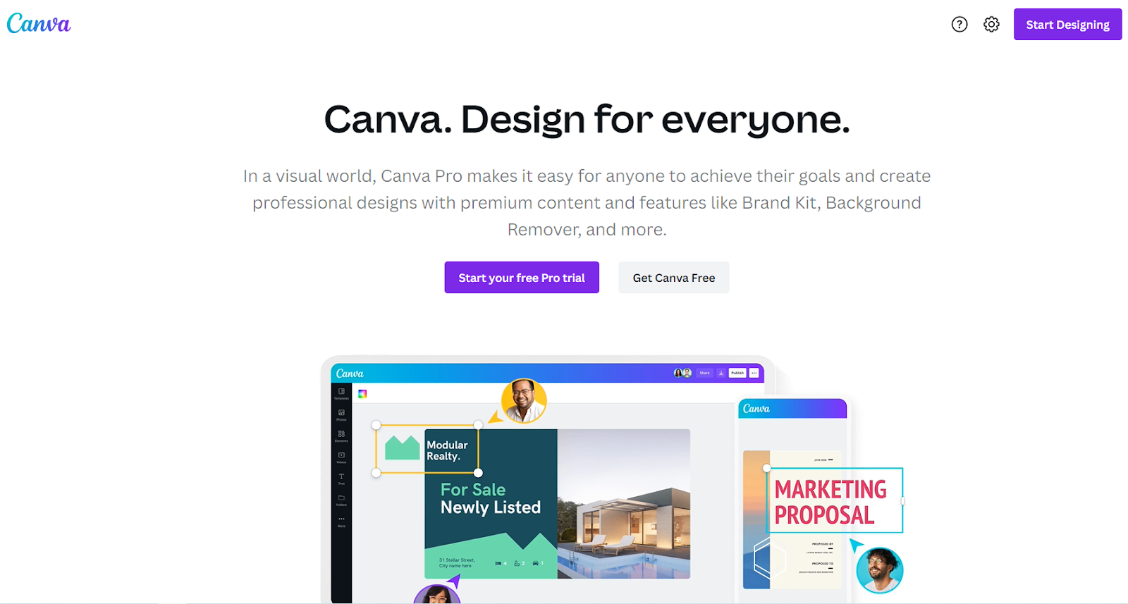
#9 Start your free pro trial - Canva
One popular signup incentive for many brands is to offer a free trial to new visitors to encourage trial and potentially signing up for a subscription.
This is exactly what Canva does on their website. Using a simple “start your free pro trial” button, they encourage visitors to give the tool a go.
But that’s not everything. On the graphic below, we can see 2 more buttons:
- “get canva free”
- “start designing”.
It looks like all three have the same purpose: maximizing the number of subscribers.
So if you have similar goals - take notes from Canva’s CTA buttons.
✔️Pro: the button’s color is eye-catching and it’s easy to notice
❌Con: the button could be slightly bigger for even better visibility
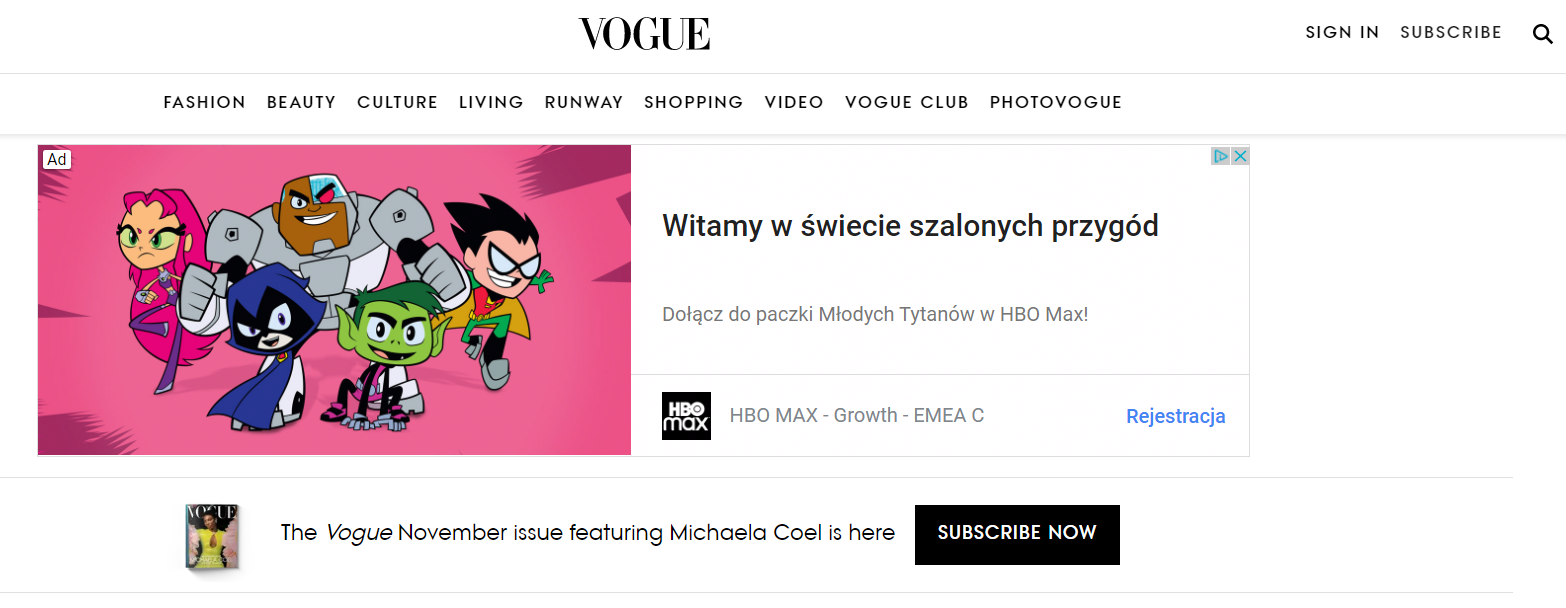
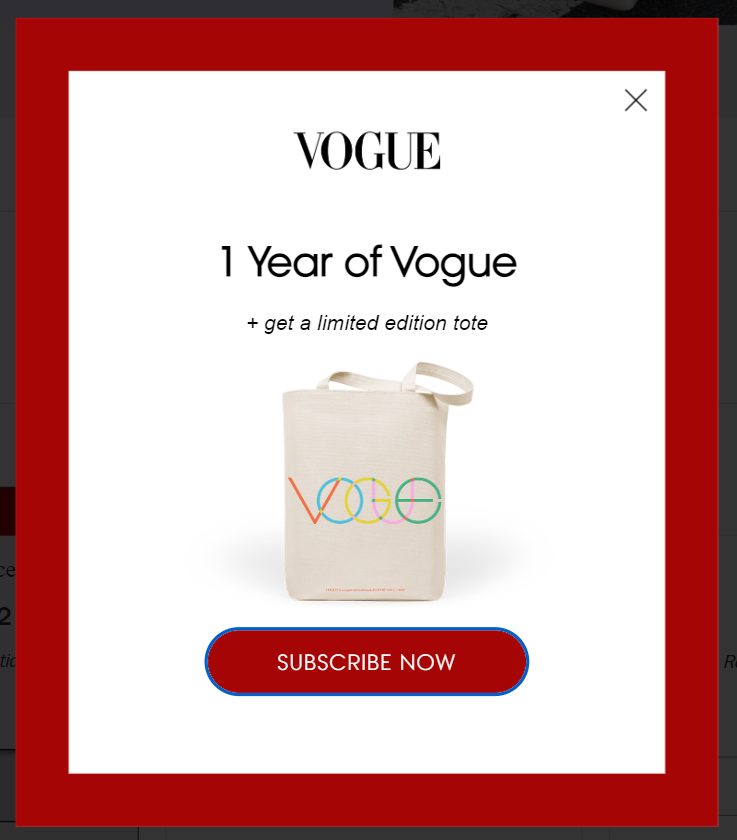
#10 Subscribe now - Vogue
Last but not least, we couldn’t forget to mention Vogue’s call to subscribe to their magazine issues.
Clicking this button will take you to the registration & payment page, where you’ll be greeted by yet another CTA - this time more aggressive, red colored. We assume it’s there to convince you to finalize your purchase, in case any doubts appeared after seeing the pricing plans.
Once again, like many of the previous examples, Vogue’s call to action image is really easy to spot. We hope you get inspired by it.
✔️Pro: it’s easy to notice
❌Con: the wording could be more inviting and interesting
Wrap up
And that would be it from us for today’s article. We hope you enjoyed reading it and found it inspiring!
Now you shouldn’t have any issues with coming up with interesting call to action images for your brand.
And if any of your CTA images lead to your social media profiles… you might want to make sure they’re spot on with FeedHive.
Check FeedHive out for the ultimate AI-powered social media management tool. It can help you with tasks like:
- creating, scheduling, publishing content,
- managing your social media profiles,
- analyse your efforts and automate various actions.
Other than that, thanks for stopping by and see you again sometime soon!
Bonus #1: Call to action button text examples
Below you’ll find various call to action button text examples to inspire yourself even more. Enjoy!
Send as a gift
Add to shopping bag
Leave a review
Find your size
Try for free
Join our program
Subscribe today
Check available plans
Get started
Click here
Sign up today
Try it on
Download
Buy now
Reserve
Add to cart
See how
Continue
Check it out
Learn more
Swipe up
Find in store
Get Started
Try today
Claim now
Bonus #2: Top CTA statistics
- the average click through rate for for CTAs is 4.23% - more than for Google Ads
- personalized CTAs perform much better than regular CTAs (202%)
- one clear CTA boosts clicks by 371% and sales by 1617% in emails
Call to action image examples FAQ
Lastly, below, you’ll find answers to some of the most commonly asked questions when it comes to call to action images and buttons. Happy reading!
What is a CTA?
In marketing, a call to action image (also known as CTA) is a prompt that invites the reader to take some specific action, such as buying a product or registering for a newsletter. Such calls to action can take place in various places and forms, like websites, email and popup.
How to write an effective CTA?
The first thing you need to do is identify what your goal is. Once you know this, you can start coming up with ideas for CTAs that will work best for your goal, e.g. what background color will you choose? What’s more, keep in mind the nature of your target audience and potential clickers - what could interest them?
Where should my CTA button lead to?
The most common use for CTA buttons is to drive traffic to the company's website, where clickers can either gice their email address for a newsletter or make a purchase. However, keep in mind that it’s up to you where you lead your clickers: it could be your social media profiles, particular page or anything else.
Where to find call to action image examples?
There’s various places you could look for call to action image examples and inspirations for your marketing campaigns. You may start by visiting various websites and reading newsletter emails. What’s more, it’s worth checking out blog posts like this one with various examples, all in one place - it's where you may find your next interesting piece of content.
Other commonly asked questions: Should I add CTAs in blog posts? What are calls to action? What’s an engaging call to action button? How to create effective CTA buttons? What should be the button color of my CTA? What are some types of CTAs worth getting inspiration from? What’s a smart CTA? Should I use a pop-up cta? What does a CTA look like on a smart phone? What’s the perfect image size for a pop up button with CTA on a mobile phone? What button style should I pick for my CTA? Can I ask for email address in my CTA? What should be the background color of my CTA button, is a bright color good, is a blue background good, is bright orange good? Is white background okay for a CTA image? Are colorful buttons okay for a CTA button? What's a good and trendy action button? What are the essential design elements for CTA images? Why is white background not great for CTA buttons? How effective are calls to action? What's a powerful action verb for a CTA? Should I add a clickable button to my CTA? Can I build my email lists with CTAs? What's the ideal image size for a CTA? Should by CTA link to my social platforms?